Talking about databases
Last month, I was invited to Eric Li’s Parsons class Instructions for Use to participate in tutorials and give a talk about my tool of choice: databases. Here are a few slides for posterity.
Last month, I was invited to Eric Li’s Parsons class Instructions for Use to participate in tutorials and give a talk about my tool of choice: databases. Here are a few slides for posterity.
Many thanks to LBU Graphics for inviting me to speak and do tutorials with final year students yesterday. I spoke about my journey from graduating to where I’m at now, splitting the talk into three sections: working for studios; running a studio; and working in-house. Great to be back in an educational setting and tour their studio facilities, including an incredible print room with screen printing, letterpress, and Risograph machines (as big as A2!).
I’m now on Mastodon! Follow me at @sambaldwin@mastodon.social. Thanks to Rutherford Craze for this great explainer.
We’re looking for our first dedicated front-end developer to join us on the Notion marketing team! Please share. More info + apply.
How it produces total delight in almost everyone almost straightaway is a miracle of design.
That’s Brian Eno writing about Kid Pix, an early Mac paint application for children. Discovered via the description for this beautiful short film: Meeting Mr. Kid Pix.
‘The optimism of modernity’ aims to tell the story of an incomplete and now almost forgotten project: that of modernity in British typography. This is envisaged as a matter not of style but of ‘design as a visible form of social philosophy’ and as an optimistic claim on enlightenment.
The optimism of modernity (via FMS).

Above all, I tried not to take it too seriously: even though I still spend almost all of my time thinking about it, it is only graphic design.
Lovely interview with Sara De Bondt over at Unit Editions.
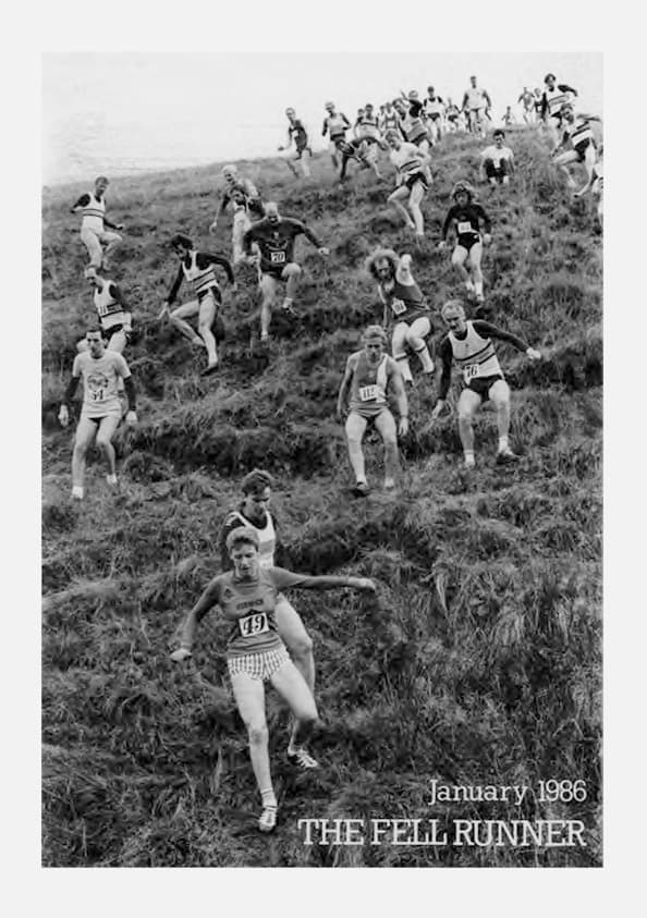
The Fell Runners Association have created an online archive of The Fell Runner magazine, including issues from 1971 to 2013. This sport and it’s surrounding culture was a huge part of my childhood in Yorkshire (pretty sure my dad owns most of these), so browsing the archive brings back a lot of memories. Most of the issues shown here are A5 size (or thereabouts). The format changed to A4 in Spring 1986, and the first full-colour cover appeared in October 1991. Here are some personal favourites of the covers.
Loop through an arbitrary number of items using the Nunjucks range function. This is very useful when prototyping to generate dummy markup or content. This example outputs 10 <div> elements:
{% for i in range(0, 10) %}
  <div></div>
{% endfor %}
You can also include the index in the output, like so:
{% for i in range(0, 10) %}
  <div>{{ i }}</div>
{% endfor %}
I used this concept all the time when prototypying with Pug, but since I’ve been working with Eleventy more I’ve decided to switch to using Nunjucks where feasible, so I’m re-learning some old techniques. For completeness, here’s the Pug method:
for i in Array(9)
  div #{i}
I’ve decided to incorporate this blog into my main site, moving it from the subdomain where it previously lived. I think I’ve correctly redirected the old feed URL, but in case it doesn’t work please point your RSS readers to: https://sambaldwin.info/feed.xml
I’ve needed to refer to browser’s default stylesheets several times and it always takes me longer to find them than it should. Making a note here for future reference and in case it’s a helpful resource for others.
I’ve excluded Microsoft Edge since it’s soon (January 2020) going to be built on Chromium.
What do you like about your favourite things? Compare pubs closely. What makes a good pub? Location, publican, people who use it, decor, privacy, good beer, comfort? Also launderettes. What makes one better to be in than another? Lighting, surfaces, facilities, efficiency? How would you make one better?
Norman Potter, “Questioning design” from What is a designer (pp.157)
Most good typefaces include OpenType alternates for superscript (superior) and subscript (inferior) figures. Web browsers don’t appear to use these by default, and instead mimic these characters by shrinking the font size and adjusting the vertical alignment. This presents a nice opportunity for some progressive enhancement.
The snippet below leverages a font’s true super-/subscript numerals by resetting the default browser styling and then setting the font-variant-position property with corresponding values for sup and sub elements. The whole thing is wrapped in an @supports ruleset, so we can display the original faux super-/subscript numerals for browsers that don’t support font-variant-position (looking at you, Chrome).
Site Query was a simple tool for constructing combined site: Google Image searches. By storing the search string as parameters in the URL, the queries could be easily saved as bookmarks or shared with other people.
An unofficial draft proposal has been authored for “scroll-linked animations”. The proposal defines an API for creating animations and effects that respond to scroll-based interactions. It covers several common patterns, such as a navigation bar shrinking effect, a navigation highlight effect, and – my favourite – a reading progress bar:
@keyframes progress {
  to {
    width: 100%;
  }
}
#progress {
  width: 0%;
  height: 10px;
  background: red;
  animation: progress 1s linear;
  animation-timeline: scroll(element(#body));
}
Chris Coyier at CSS-Tricks writes:
I love it when web standards get involved because it sees authors like us trying to pull off certain design effects and wants to (presumably) help make it easier and more performant.
Personally, the Apple Watch is interesting to me not because it’s a watch. Rather, it’s interesting to me because it’s a smaller-than-normal touchscreen attached to a cellular antenna, and one that’s not necessarily on the most reliable connection. It helps me look past the device, and to think about how someone will interact with my work under those conditions. Once I do that, I can start to design accordingly.
Ethan Marcotte: It’s not about the device. See also: Device Agnostic (2014) by Trent Walton.
As a big fan of macOS Mojave’s dark mode, I was excited to see a new media query for targetting this user preference land in a recent release of Safari Technology Preview.
I’ve seen others add support to their websites by redefining colour variables or properties – which is probably the way to go in most cases. But it occurred to me that since this blog (currently) contains no images or rich media, I can get a very cheap dark mode by inverting the whole document using the filter property, like so:
@media (prefers-color-scheme: dark) {
  html {
    filter: invert(100%);
  }
  audio,
  canvas,
  embed,
  iframe,
  img,
  object,
  video,
  svg {
    filter: invert(100%);
  }
}
To see for yourself, open up this page in the latest Safari Technology Preview.
For good measure, I’ve also included a rule set to invert the images, videos, and other replaced elements back to normal, so that these don’t get inadvertently affected should I include them in future. This idea is borrowed from Are.na’s stylesheet, where they scope their dark mode styles to an .is-inverted class (try it out on their site by using the keyboard shortcut Ctrl + Shift + i).
So you have to adapt your society or technology to a new type of energy source. We actually need a lot of innovation because all our technology is based on fossil fuels, and it doesn’t really work with intermittent power sources. Which could be done, for instance: in some developing countries, internet networks are not always on. They are indeed intermittent, because they work with solar panels. Every internet node has a solar panel, and the data only gets from one node to another if there is sun. Your email might take three days to arrive, depending on the weather. So you can adapt basically anything to an intermittent energy supply. It’d be a kind of cultural shift towards something more sustainable.
This summer we got to watch a workshop created by a few friends that used colorful cardboard blocks to imagine the internet as a city. Together they built structures that represented different ways of organizing the infrastructure of the web. “If the Internet were a city,” they asked, “what would be its roads, buildings, and parks?”
What we gained with modern web technology is the ability to have the layout (and even fonts) automatically react to outside conditions like screen format, device capabilities, user preferences, or even reading distance. Design is no longer about tailoring invariable content to one specific embodiment; the web forces us to think about typography in terms of parameters and to get clear about content versus form.
Clearly, all of this is a far cry -- and a lot of extra busy work -- from the act of merely listening to music. In fact, I spend much more time acquiring, cataloging and archiving my artifacts these days than I do actually engaging with them. The ways in which culture is distributed and archived has become profoundly more intriguing than the cultural artifact itself. What we’ve experienced is a inversion of consumption, one in which we’ve come to engage in a more profound way with the acts of acquisition over that which we are acquiring; we’ve come to prefer the bottles to the wine.
Having spent a significant amount of time in design classrooms critiquing work and cutting my teeth, I sympathize with students who feel the pressure to create work imbued with austerity. Students easily fall into the trap of thinking that if something doesn’t feel clean, and professional, that it isn’t good. If it isn’t good, they won’t get a job. If they don’t get a job, they can’t pay off their loans. Obviously, I disagree. This notion is dangerous, and can strip professionals of the joy that is vital for sustaining careers.
TIL about the <mark> element (HTML Mark Text element) – an inline tag used for highlighting a passage of text. Most browsers apply a fitting bright yellow background and black text by default. For example (via MDN):
When used in a quotation (
<q>) or block quote (<blockquote>), it generally indicates text which is of special interest but is not marked in the original source material, or material which needs special scrutiny even though the original author didn’t think it was of particular importance. Think of this like using a highlighter pen in a book to mark passages that you find of interest.
Quoting a passage from another source and adding commentary is such a common post type on many popular blogs, that I’m kind of surprised this tag isn’t more commonly used. For designers I think it provides an interesting typographic opportunity, and for content authors a helpful alternative to bold and italic styling.
A good friend and I have started casually walking London’s Capital Ring, a 78-mile walk (split into 15 sections) which covers “open space, nature reserves, Sites of Specific Scientific Interest and more”.
Making a note of this since I always forget…
Tracking and kerning in InDesign are both measured in 1/1000 em, which is relative to the current type size. To map these values to CSS ems you just multiply by .001.
Here are some examples with InDesign tracking in the comments:
/* -40 x .001 */
letter-spacing: -0.04em;
/* 5 x .001 */
letter-spacing: 0.005em;/* 20 x .001 */
letter-spacing: 0.02em;
Since GitHub doesn’t allow you to directly follow organisations like you can users, I began collecting interesting ones over at Are.na. The criteria reflects my general interest and familiarity with the organisation, but contributions are welcome!
“… even the choice of a typeface for me is always this extremely laborious choice of trying to decide on what really makes sense for this context, what resonates historically, what is interesting in its own immediate context. There’s like a million decisions that go into that.”
Prem Krishnamurthy on Scratching the Surface ep. 13 (~23.5min). See also P!DF.
A briefly-researched selection of type foundries that offer tracker-free webfont files for self-hosting:
Gerhard Richter on grey:
Grey is the epitome of non-statement … it does not trigger off feelings or associations, it is actually neither visible nor invisible … Like no other colour it is suitable for illustrating "nothing"
I was asked to contribute some links to an online resource compiled by Occasional Papers.
This list of references was compiled on the occasion of the Post-print Publishing? event at Liverpool Biennial in July 2013. Compiled with help from Sam Baldwin, Vanessa Boni, James Goggin and Radovan Scasascia.